WELLRITHMS / REBRAND
Boldly disrupting a broken system that exposes the fraud, waste and abuse in healthcare billing.
The Challenge
Medical overbilling costs self-funded employers, unions, and administrators billions of dollars every year — it hurts everyone. WellRithms helps payors eliminate those losses by reviewing medical bills, repricing them based on the true market value for services, and guaranteeing the savings. Using a proprietary AI solution, backed by real physicians, WellRithms stands apart from other bill review companies by fully shielding payors from financial and legal liability. However, their brand did nothing to communicate this powerful difference, leaving them in indistinguishable in the market.
Fort West was tasked with developing a bold brand that cuts through the clutter, clarifies their offering, and demonstrates the incredible value WellRithms brings to payers and patients alike.
Visual Positioning
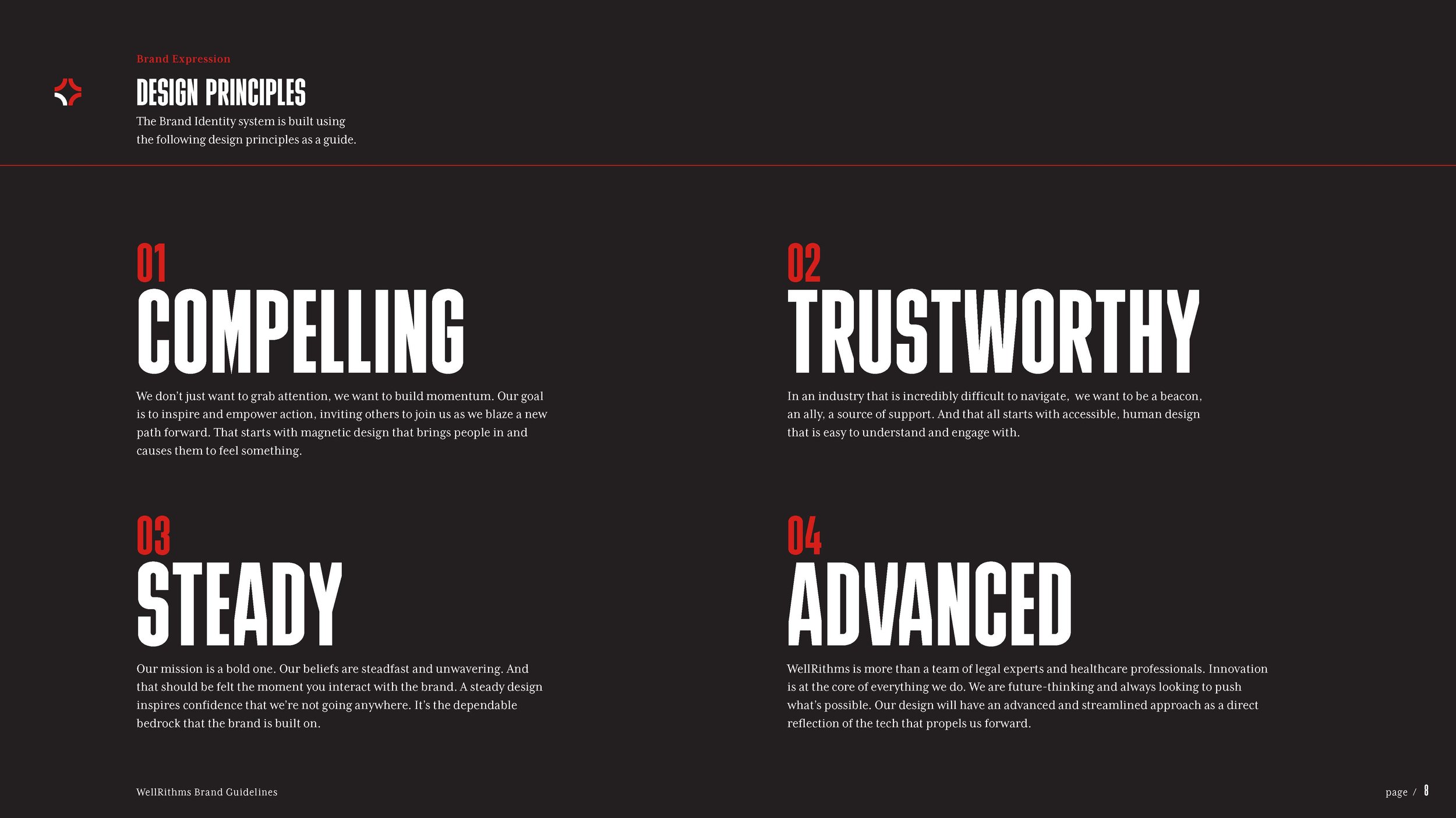
Under the guidance of our new brand character, the Principled Pioneer, we created a completely new ethos for the brand. Our design theme embraces the pursuit of justice — reflecting steady progress and an enduring vision for a better future that never loses sight of the people we’re doing it for.
In our round one feedback, the client had bought into the first concept with changes that stretched it too much. Rather than accepting the new look, I took a chance and developed a new look and feel. Some feedback I picked up on, was “We need to have a backbone in this industry.” The Principled Pioneer had a message to share. Visually, we wanted to say it with gusto.
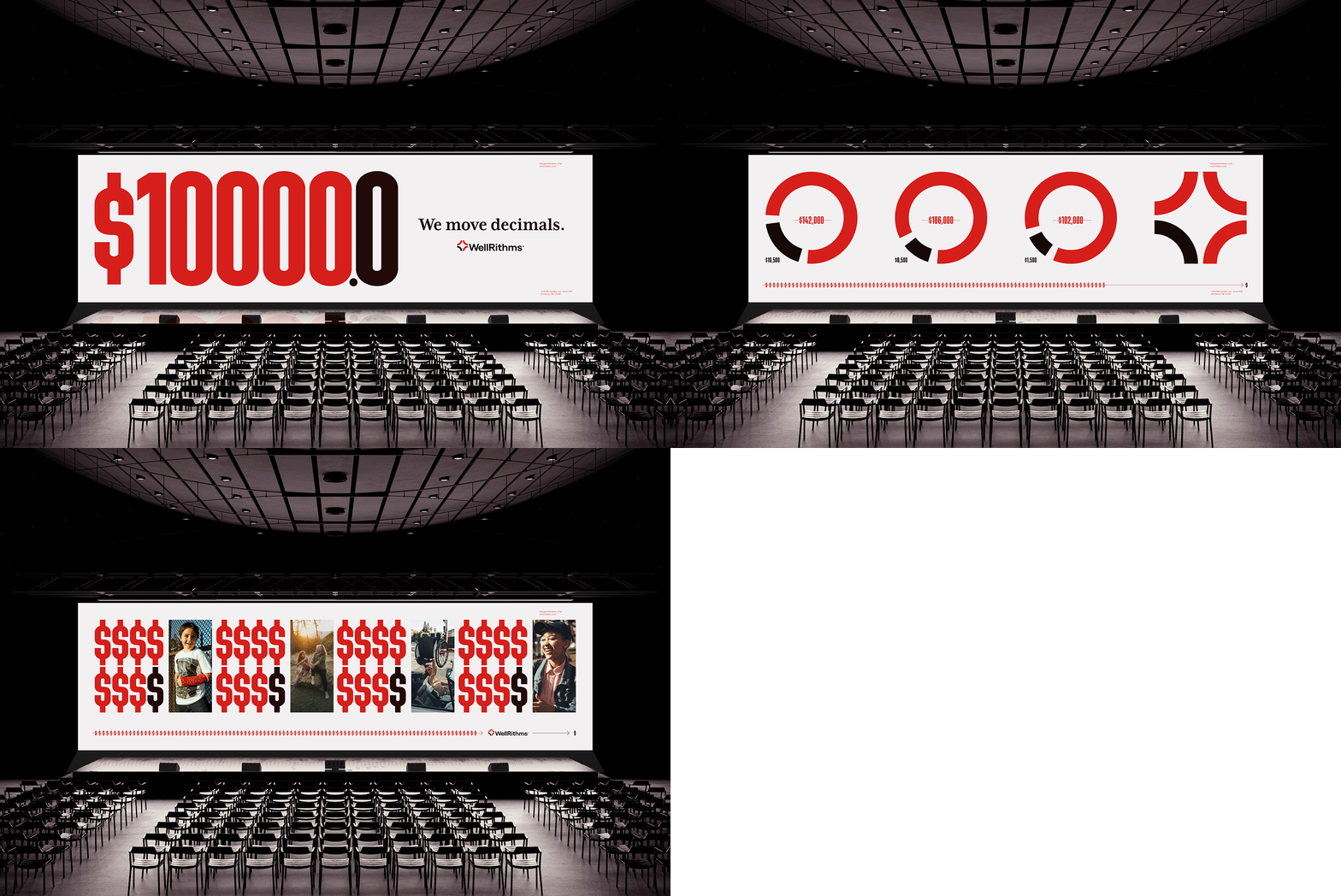
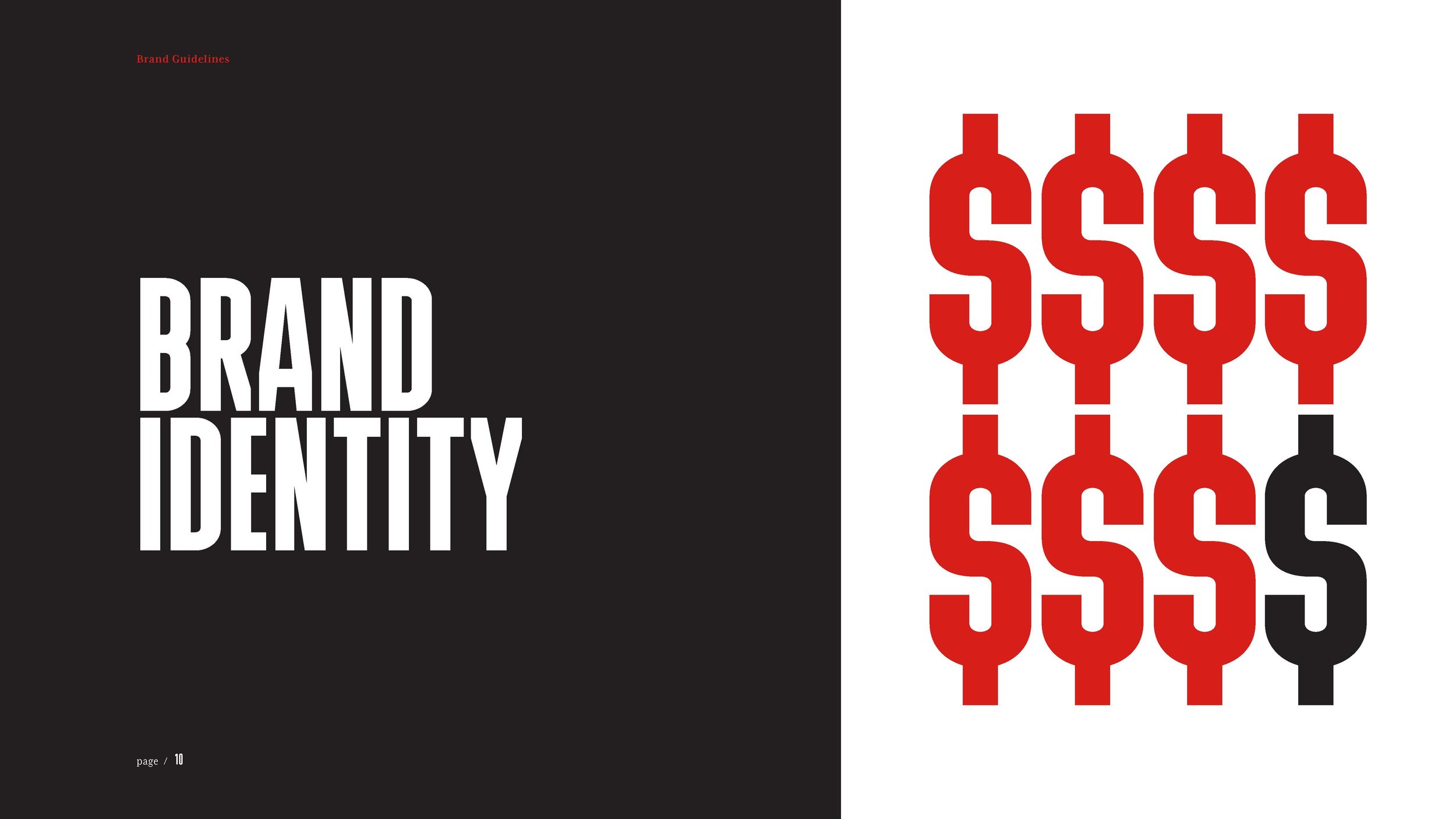
Bold. Truthful. Expressive. We’re calling for a better tomorrow. We use strongly worded type. Condensed, ALL CAPS letterforms speak with energy. Our imagery connects with the people of whom it’s all about — in an honest unfiltered editorial look.
Old
New Visual Identity
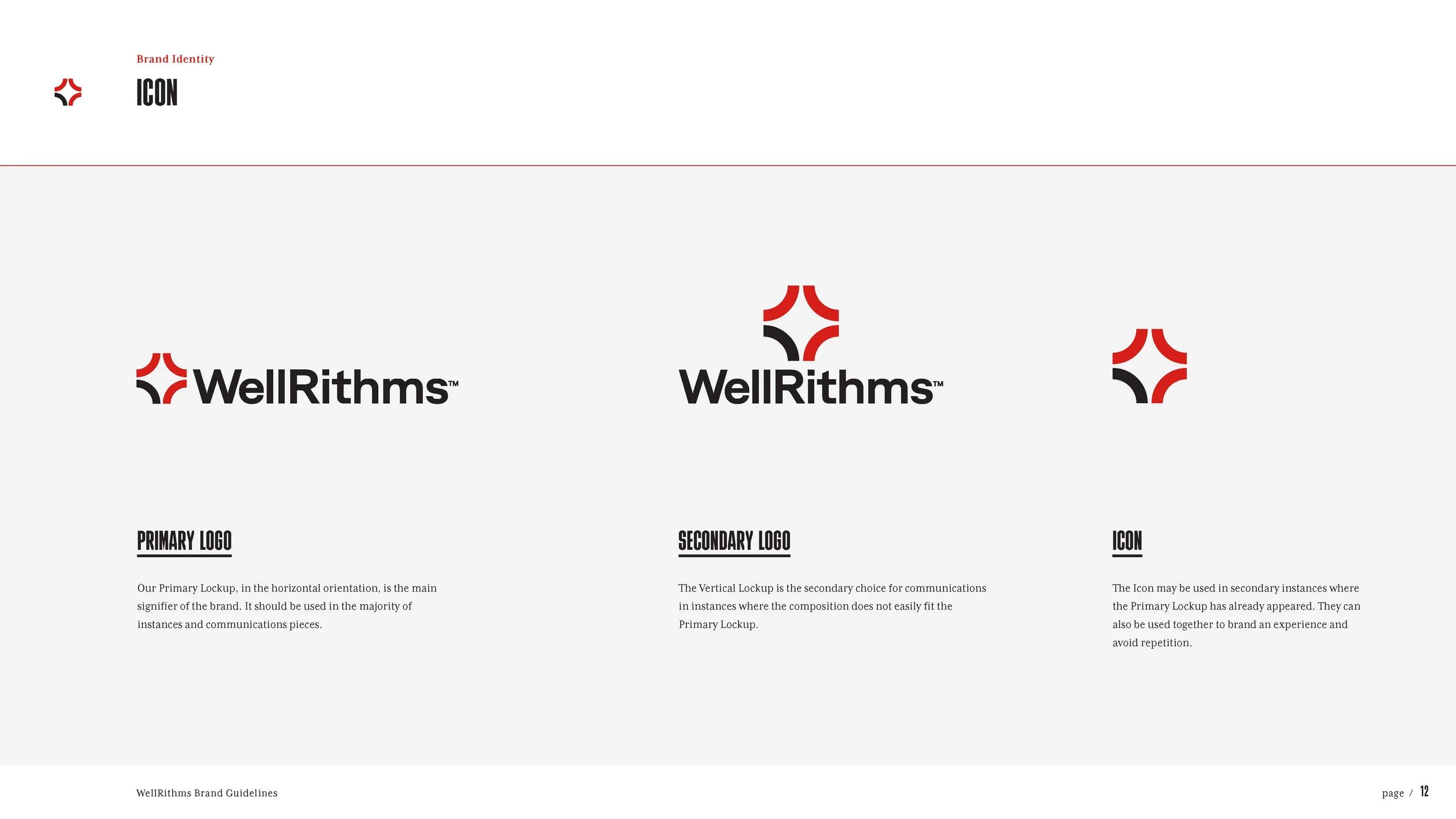
Our new mark, named “The North Star”, symbolizes the tension between innovation and a broken system. A broken black and red circle emphasizes data, showing the contrast between actual costs and excess billing. It’s distinct, and pushes against the norm. However, despite the tension, the logo carries a sense of hope, optimism, and a call to action for positive change and transformation.







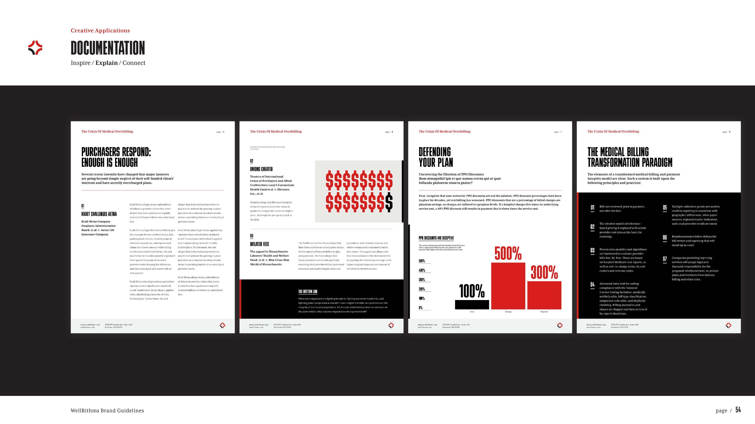
“Our rebrand has helped us find our voice. We now have a common language that all agree on, and when we each want to go our own direction, we’re able to come back in a unified way and really be WellRithms, inside and out. ”
— Anna Quorum, Co-Founder & Chief Operating Officer
Responsibilities
Art Director
Concept Development
Visual Positioning
Selling in Concepts to Clients
Identity Design
Application to Marketing Channels
Team
Fort West
CD - Maliah Candace
ACD/Writer - Chase Stevens
Production and QA - Rene Choy


